Who Congressional Parties Retweet
- Zayne Sember

- Jan 24, 2020
- 9 min read
All code for this project can be found here
Why Does It Matter?
Twitter is a key tool of congressional campaigns and offices in modern US politics and as such there have been a number of studies looking at its use by members of Congress (this and this are a couple of examples). What I’m interested in here are not individual members’ Twitter activity but the activity of the House Democrats (@HouseDemocrats), House GOP (@HouseGOP), Senate Democrats (@SenateDems), and Senate GOP (@SenateGOP). My theory is that the content of these accounts can offer insights into how the parties in each chamber use Twitter and whether their tweets, retweets, and likes jive with the members of Congress (MCs) in their party.
Specifically for this post, I’m looking at who these accounts are retweeting. A retweet is a powerful tool in the Twitterverse because it shoves the tweet of someone you aren’t necessarily following in front of your eyes. At the time of writing this, the House and Senate Dems have 960,000 and 995,000 followers respectively, and the House and Senate GOP have 856,000 and 945,000 followers—not an audience to scoff at.
Political science reasons aside, this is a fun way to practice manipulating and visualizing data in Python, working with APIs, and thinking critically about social media.
Methodology
The backbone of this project is the Tweepy library for Python, an easy to use means of accessing the Twitter API. If you have a decent grasp of Python or working with APIs then getting the hang of it shouldn’t be much of a hassle. I also chose to do most of my programming (aside from some custom functions in a separate Python file) in a Jupyter Notebook since the ability to run cells individually and intersperse Markdown makes things easier to understand and reduces API calls (which are limited by Twitter).
Aside from Tweepy, I’m using some of the usual suspects when doing anything sciencey with Python. For plots and tables, I stuck with matplotlib’s pyplot (although its table customization is limited). While I did import scipy and numpy, I didn’t use them for this current implementation but that may change if I decide to improve on what I’ve done here.
I won’t dig too deep into how exactly I got from the Twitter API’s Tweet objects to usable data, you can look at Analysis_of_Retweets.ipynb and cf.py for that but I will point out one example of the kind of programming necessary to complete this project.
The trickiest parts of my code come about when visualizing the data. Plotting in Python is highly customizable but getting things just right can be time consuming. An example is getting the labels on my pie charts to be readable and not overlap. The simplest option was to only place labels in the legend and leave the chart itself without text but that looks boring. If I include labels for each slice and have 4 categories at 0.5% there is no way to prevent them from overlapping (Excel may automatically deal with this but pyplot certainly doesn’t). Further, if I rerun the script with a different composition of retweets I want to be guaranteed there won’t be overlapping so brute forcing the chart to look good isn’t an option.
To make the pie chart in the first place I needed a list of values (in my case percentages of retweets in a given category) and a list of labels (the name of the category). To prevent these labels from getting cluttered and to give them the desired formatting with the category name and percentage value below it I implemented this function:

It takes in the list of labels and the list of values (assumed to be the same length) then, for each element, I append a string to output_list_all in the desired format and, if the value associated with the label is greater than 2.0%, I also append that string to output_list_large, if not, I append an empty string (“”). I then return the two lists, output_list_large now contains only the labels with values large enough that I can safely display them by the slice (and empty strings that won’t display anything for smaller slices) and output_list_all has the labels for all slices, regardless of size.
With these two lists I can now always display the list containing large values with no worries of overlapping labels. Now how do I show a legend on the chart if, and only if, I couldn’t display all of the labels by their respective slices? Easy, just check whatever my output_list_large contains any empty strings, if it does then display a legend with my output_list_all. Of course there is still a bug with pyplot that results in the legend not being included when the figure is saved as a PNG but everything displays fine within the notebook.
The point of this long winded tale is to illustrate that something as simple as getting labels on a pie chart to display properly can require a surprisingly tricky solution but the ability to implement such a solution is what makes using Python (or R or Matlab) for data visualization so worthwhile.
Difficulties/Improvements
The first improvement that could be made to this project is vectorization. I use a nauseating amount of for loops and Python lists to cobble together and transform data. For the small numbers of tweets I’m working with here this works fine but for larger scale projects vectorization would be necessary. The easiest way to do this would likely be replacing lists with numpy arrays, resulting in faster and prettier code.
More difficult than vectorization is the problem of maintaining and expanding the CSVs with the relevant Twitter users I created to easily pull more info and categorize data. I sorted the retweeted accounts (or retweetees as I call them) into six categories: representatives, senators, committees, caucuses, media/journalists, and other. The retweeting account could also be considered a category when it retweets itself but one that’s much easier to handle than the other cases.
For MCs, CSPAN’s lists of representatives and senators came in handy and I assume it is regularly updated. I initially tried to use this repo but found it to be incomplete. Rather than manually transcribing handles, it may be worthwhile to write a short script that uses Tweepy and these lists to update the CSV every week—that’s a potential future project.
Compiling all of the handles for congressional committees is a more challenging task given that CSPAN’s list seems to be incomplete; I was able to find more than the 35 accounts they list. I don’t see any easy way to automatically update this list but with more thought something may be possible and new committees are rarely formed.
Harder yet is compiling the handles of congressional caucuses, given the incredible number of them and the fact that most have no official Twitter account. I did my best to include as many as I could find but I’m sure my list is incomplete, or will be as soon as a caucus decides to create a new account.
Lastly, the hardest of all is maintaining a list of media/journalists—this one is probably impossible to perfect. My current list has the big media outlets and some frequently retweeted journalists but stops there. I’m missing 99% of the media accounts on Twitter but there isn’t much that can be done aside from tack on more accounts as I find them. Another option is to perhaps remove this category entirely since having an incomplete list of media is likely just as useful as lumping them into the “other” category.
Any improvements to compiling any of these lists are welcome. Fixing my lackluster approach here may be a future project anyways.
Results
Because this was my first major whack at using Python for political science and Tweepy in general, the actual results of this project are pretty limited but interesting nonetheless. First of all, here are the tallies of who gets retweeted by each account. These tables can help to make sense of some of the later results so I will touch on them later.
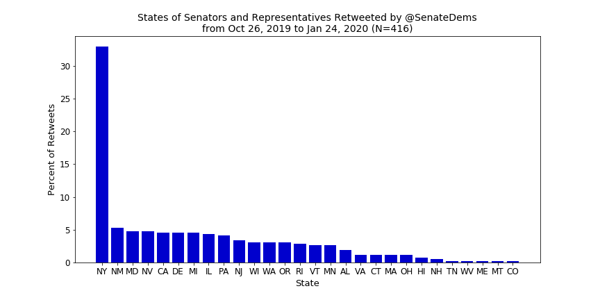
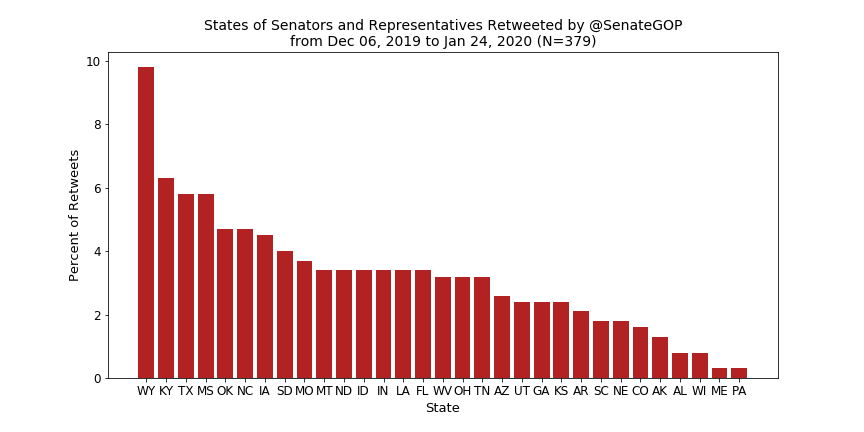
The first metric I wanted to look at was which states get the most love when it comes to retweets of MCs—below are the results.

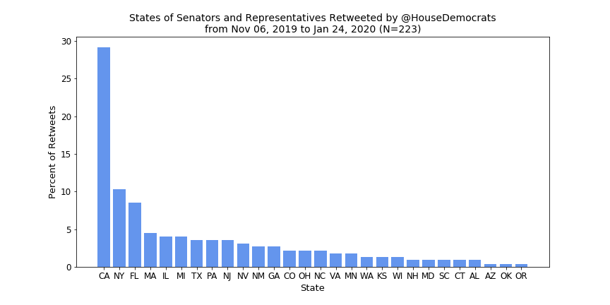

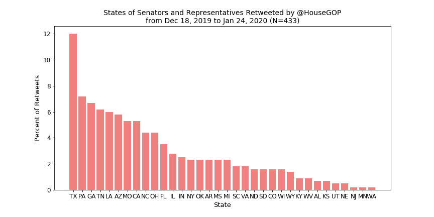


Looking first at the House Dems (and the table above), it is clear that Speaker Pelosi and Rep. Adam Schiff (because of his position as chair of the House Intel Committee and now as an impeachment manager) are the cause of California’s spike. You might suspect a similar spike would appear for the House GOP because Minority Leader McCarthy also hails from California but instead Texas reigns supreme and, if you look back to the tally table, this doesn’t seem to come from any one member getting retweeted excessively. The GOP seems to spread their retweets out across a number of states while the Dems stick mostly to California (because of Pelosi), New York, and Florida.
For the Senate Dems, New York sees an even more prominent spike than California did for the House, thanks to frequent retweets of Minority Leader Schumer, and a relatively flat distribution otherwise. The Senate GOP, however, does not have a comparable spike for Kentucky due to Leader McConnell (although it is the second most retweeted state). Instead, Wyoming wins out thanks to retweets of Sen. John Barasso, the chairman of the Senate Republican Conference.
The asymmetry between the parties here is interesting. One may think that Pelosi is retweeted so much and McCarthy so little because the in-party’s leadership is more prominent but the results for the Senate seem to contradict this. I see two possible explanations for these results:
1. The Democrats are making a more concerted effort to support their leadership in both chambers while the GOP is more concerned with highlighting members from a range of states and defending the White House.
2. This speaks less to party strategy and more to the personality and focus on social media of the leadership. Pelosi and Schumer both put an emphasis on visibility online whereas McCarthy and McConnell take a more behind-the-scenes approach.
To really understand what’s happening here I would need to collect more data and possibly exclude the past few months because of the impeachment skewing results.
Next I made a breakdown of retweets by category (the six mentioned earlier).

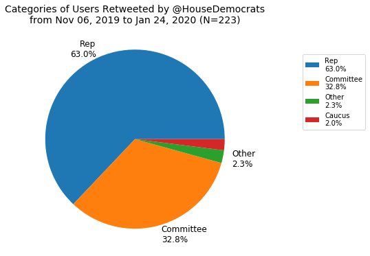

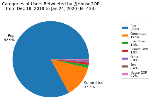


As expected, for the House Dems and GOP, representatives are the most frequently retweeted group followed by committees, more so for the Dems. It should be noted that the fact that the Dems have more than twice the percentage of committee retweets as the GOP is probably an anomaly resulting from the impeachment and trial of President Trump which involved the House Judiciary and Intel Committees. I think the most interesting difference here is the lack of caucuses being retweeted by the GOP but I don’t have a good explanation for this.
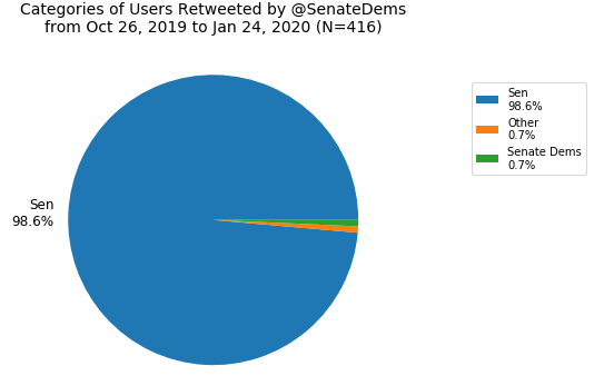
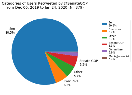
For the Senate, right off the bat, the Dems’ chart is remarkably homogeneous—the account virtually only retweets senators. The GOP’s chart is a bit more diverse with a small but not inconsequential amount of retweets of the executive branch and self retweets but still the vast majority of retweets are of senators. Unlike the House, committee accounts are rarely retweeted by either party in the Senate.
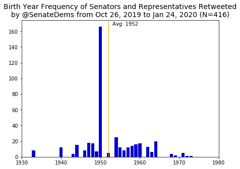
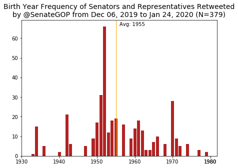
Now onto birth years of retweetees.

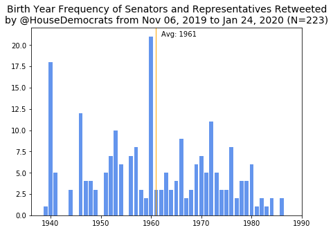

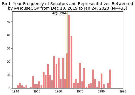


As was the case with the state distributions, because I’m using frequencies, spikes for Pelosi (born in 1940) and Schiff (born in 1960) appear for the House Dems. Likewise, the peak at 1965 for GOP is because both McCarthy and Scalise were born that year. Perhaps thanks to such frequent retweets of Pelosi, the average birth year of a Dem retweetee is actually older than that of a GOP retweetee, with the averages at 1961 and 1964, respectively. The average birth year for the 116th Congress House members is about 1961, meaning that the GOP is retweeting younger than average members, but not by much.
Moving to the Senate, for the Dems, Schumer’s peak (born in 1950) is once again clear. For the GOP, Barasso (born in 1952) also leaves his mark again. As a surprise to no one, the average retweetee for both parties in the Senate is about ten years older than the House. Once again the Dem retweetees are, on average, older than the GOP, with averages at 1952 and 1955. The average birth year of the 116th Congress Senate members is about 1956, so both parties are retweeting older than average members, but again not by much.
The fact that the House Dems and both parties in the Senate retweet a slightly older demographic probably hints at more senior members getting the limelight but it is still surprising to see GOP looking younger.
Finally, I have the average first and second dimension DW-NOMINATE scores of MC retweetees (note that the timespan of tweets for these averages is the same as previous charts)

In the first dimension, the Senate is less extreme than the House for both parties but in both chambers the GOP retweets more ideologically extreme members, on average, than the Dems. The second dimension is a bit weirder, with the House and Senate GOP having virtually the same score while the House Dems have a score two magnitudes smaller than their Senate counterparts—this may be a consequence of how the second dimension is calculated but I’m honestly not sure what is happening here.
Conclusion
This was a fun exercise not meant to find anything groundbreaking but rather to familiarize myself with some tools and methods that could be used in a more serious investigation. Obviously, a much larger sample size would be needed to assert any real conclusions from this, especially considering my data is tainted by the impeachment and trial. Regardless, Twitter is a neat lens to view our political moment through and I’d like to do something more substantial in this vein soon. In the meantime, if you’re interested in an in-depth analysis of political twitter check out this paper about whether the 2016 election increased online hate speech. Thanks for reading.


link link link link link link link link link link link link link link link link link link link link link link link link link link link link link link link link link link link link link link link link link link link link link link link link link link link link link link link link link link link link link link link link link link link link link link link link link link link link link link link link link link link link link link link link link link link link link link link link link link link link link link link link link link link link link link